When you look at a world map, it’s easy to think countries like Russia or Greenland are enormous. However, the actual surface area of these places can be surprisingly different from what maps lead us to believe. This discrepancy arises from map projections, which adjust the Earth’s spherical surface to fit a flat map. But why do these distortions happen, and which countries are most affected?
What is the Mercator Projection?
The Mercator projection, created in 1569 by Gerardus Mercator, was designed for navigation. It preserved the angles of travel routes, making it invaluable for sailors. However, it achieves this by distorting the size of land masses, particularly near the poles. Countries closer to the equator appear relatively smaller, while those further north or south, like Greenland and Russia, look enormous compared to their actual land area.

How Different is the Reality?
If we compare land areas accurately, here’s what the scale would look like:
- Greenland: Appears almost as large as Africa on a Mercator map but is only about 1/14th the size in reality.
- Russia and Canada: Appear as colossal landmasses, yet they’re closer in size to the United States and Brazil than it might seem.
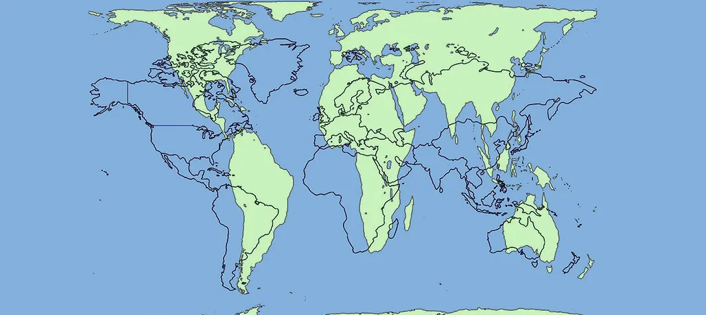
- Africa: Significantly smaller on a Mercator map, Africa can actually fit the USA, China, India, and much of Europe within its borders combined.
Other Projections that Offer a More Accurate Perspective
While the Mercator map is the most well-known, other projections like the Gall-Peters projection try to present a more accurate view by adjusting for area distortion. The Gall-Peters map, for example, shows continents more accurately by area but distorts shapes, especially around the equator.
Why It Matters
Map projections affect how we perceive the world, including our ideas about geopolitical power, distance, and cultural significance. For instance, seeing Africa portrayed closer to its real size emphasizes its vastness and influence in ways we miss on a Mercator map.
Final Thoughts
While no flat map can truly replicate Earth’s dimensions, understanding map projections reminds us of the hidden biases in visual information. The next time you look at a map, remember: there’s more to size than meets the eye.


Leave a Reply